

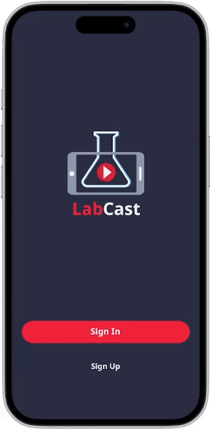
LabCast
Client: Stanford University
An IOS app designed to modernize access to scientific research


LabCast promotes accessibility to scientific research
By implementing an AI-driven algorithm to push relevant topics toward the user, I worked closely with the client to develop an intuitive app for people curious about the world’s most recent scientific findings.
My Role: UI/UX + Brand Designer
Client: Jack Zeng (Director of IT Applications Department of Medicine, Stanford University)
Tools: Figma, Adobe Illustrator, Photoshop
Project Duration: Summer 2025
Connecting users together to discuss new discoveries
My task was to design a mobile application that allows users to listen to medical journals, interact with comments from other users, and reach out to corresponding authors. Some key features the client wanted to include were:
Audio-book style research journals.
Live Q&A experiences with corresponding authors.
AI utility for core functions, like summarizing abstracts, audio-casting articles, and chatting with AI assistants.
Multiple iterations of the app were presented and discussed with the client via online video meetings. LabCast would then be coded and brought to life by the client’s students.
Table of Contents
01
Discovery
02
Ideation
03
Design
04
Revisions
05
Final design
06
Reflection
Discovery

The challenge
Reliable scientific research remains difficult to access. Free online public resources contain fragmented information, and the UI is often too archaic for most users. With learning new information will come new questions, and connecting with research authors in real time can prove to be time-consuming and inconvenient.
LabCast was created to bridge the gap between accessibility and knowledge. This brings the challenge of combining the casual convenience of social media with the professional nature of scientific research journals.
Insights and pain points
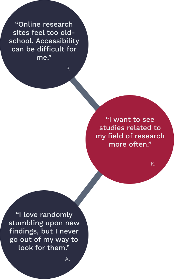
Current public journal sites look and feel outdated. Accessibility feels limited with the archaic clunkiness that comes with popular sites, such as PubMed and Google Scholar.
Paywalls limit access to information. Free versions of online journal sites restrict how much the user can view.
Finding specific information means combing through multiple sites. Most participants use several websites to dig for relevant information, so their search can become disorganized.
There is often no direct way to reach out to authors. Questions are often inquired through “cold call” email to the research author. Several have expressed frustration with slower response times due to the nature of emails.
I interviewed five prospective users who are currently working or studying in the scientific field. The participants fit in the client’s target demographic of professionals interested in viewing scientific advancements. Some common themes in the interviews include…
Gathering data on the average user’s pain points, needs, and motivations, I strove to answer the question…
How could we help users access scientific journals intuitively?
Ideation
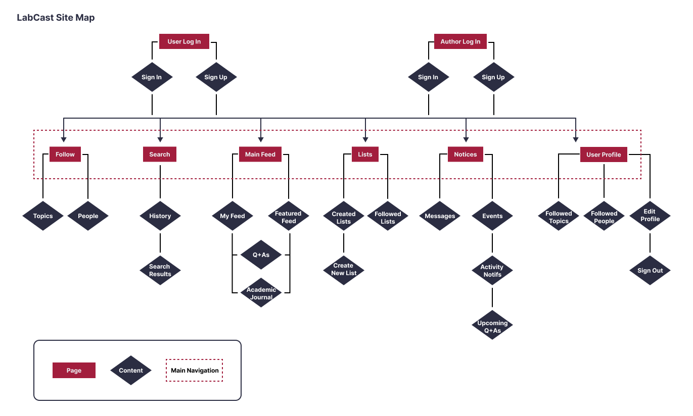
A sitemap designed for science
At the project’s start, The client had already proposed a user flow interaction.
Using that information, I created a sitemap that incorporated both his task flow, and the core functionality of social media. Popular apps such as Reddit, X, and Spotify inspired my design. As a social app that’s designed for professional research, I strove to strike a balance between the main content of science journals and user interactivity with discussion opportunities.
Design
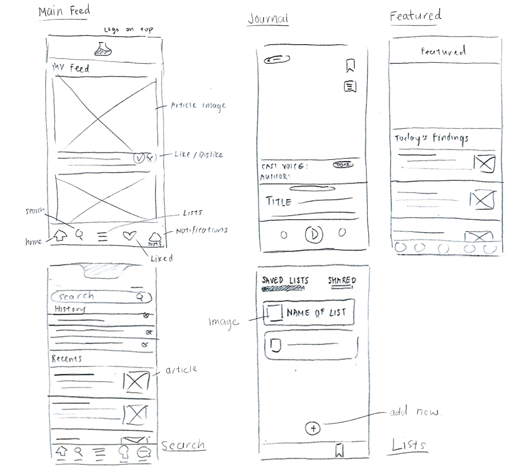
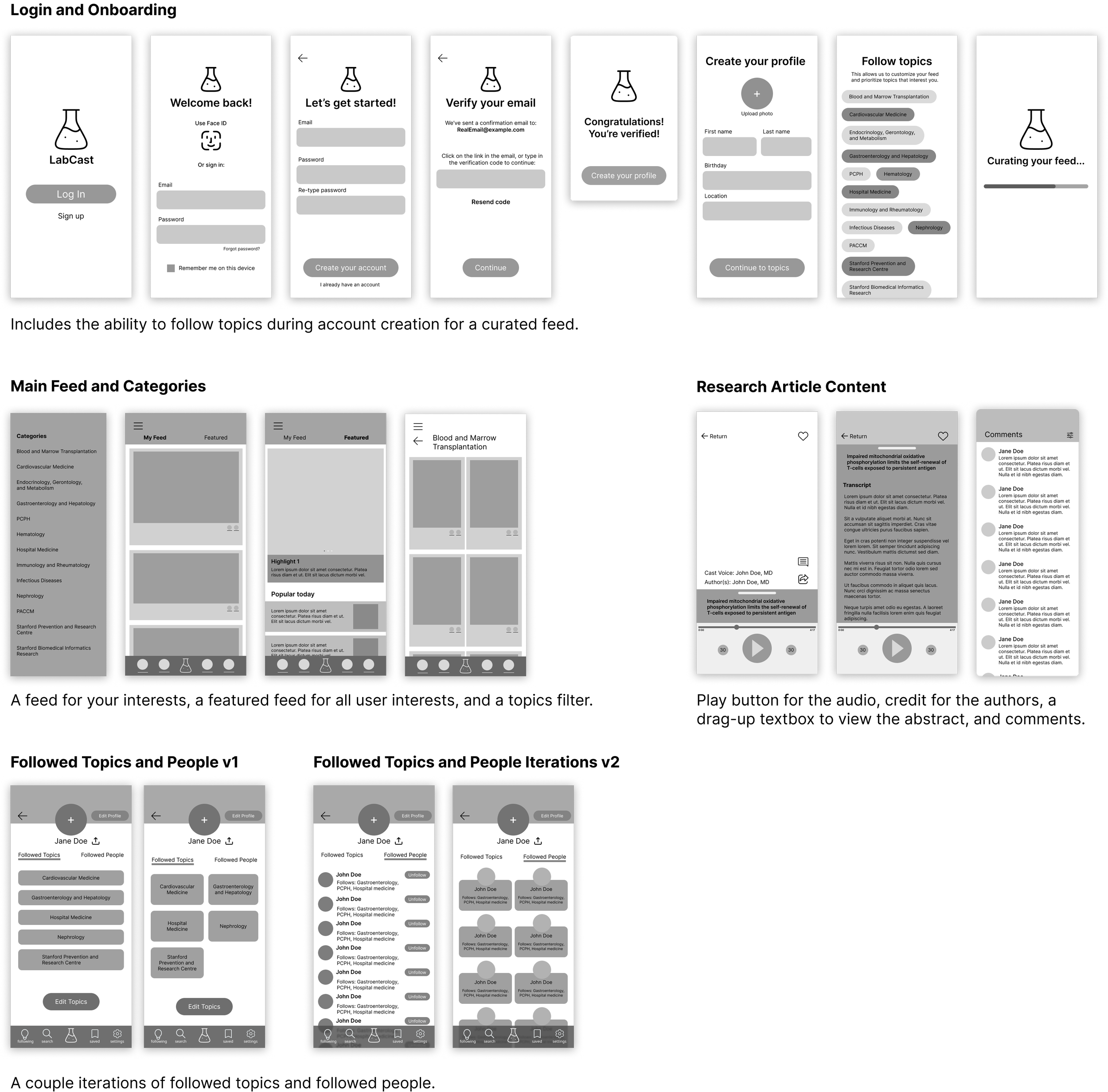
Low-fidelity wireframes
Early wireframe sketches explored main navigation layouts, including the onboarding process, main feed and articles, and Q&As. I prioritized intuitive accessibility by adding a bottom navigation bar that can direct the user to their chosen page from anywhere.

Mid-fidelity wireframes
My main focus became organizing the features that the client wished to include without overwhelming the target users.
I chose to condense information by adding additional tabs in each main screen, so users could choose to swipe between two functions. This was inspired by X’s “For you” and “Following” tabs.
High fidelity designs
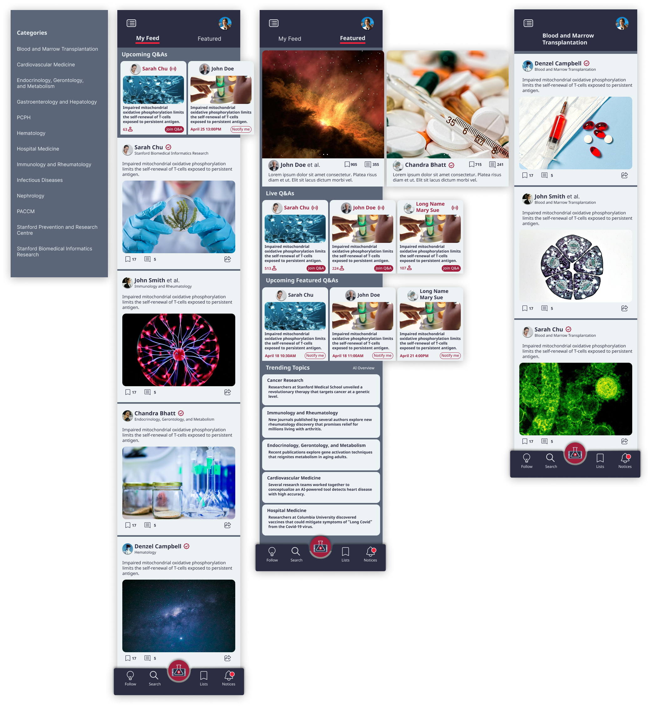
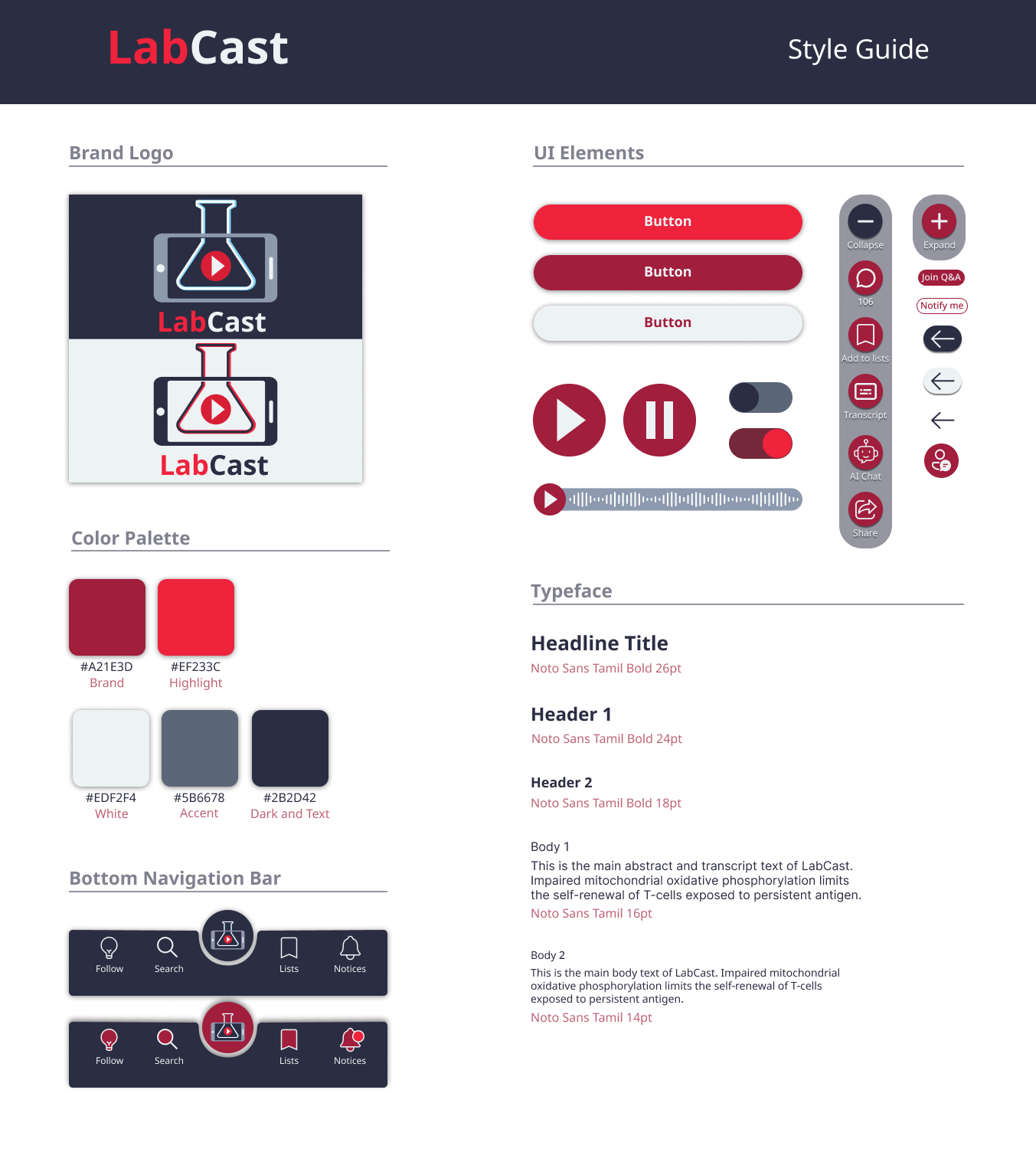
Mixing social media with scientific research, I strove to create a sophisticated, yet intuitive design. Neutral colors for the base palette prevents distraction from the educational nature of Labcast’s content, while the contrasting red guides users throughout the app.

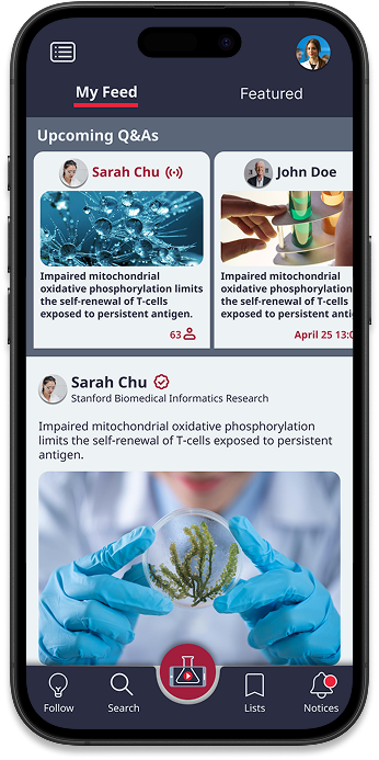
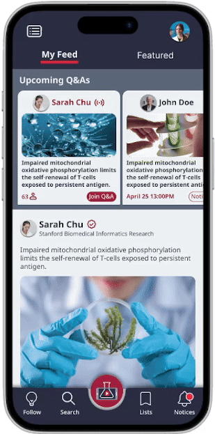
Onboarding screen: Users can opt to import profiles from other apps so Labcast can curate an algorithm based on the user’s interests.
Main feed: With a smart AI algorithm that focuses on user interactivity, “My feed” provides content catered toward the user’s personal interests. “Featured” showcases popular information that is rising amongst all users in the app.
To help mitigate the information overload a social media app can contain, I opted to create a side-scrolling feature for limited content, such as Q&As and featured articles.
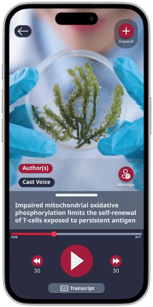
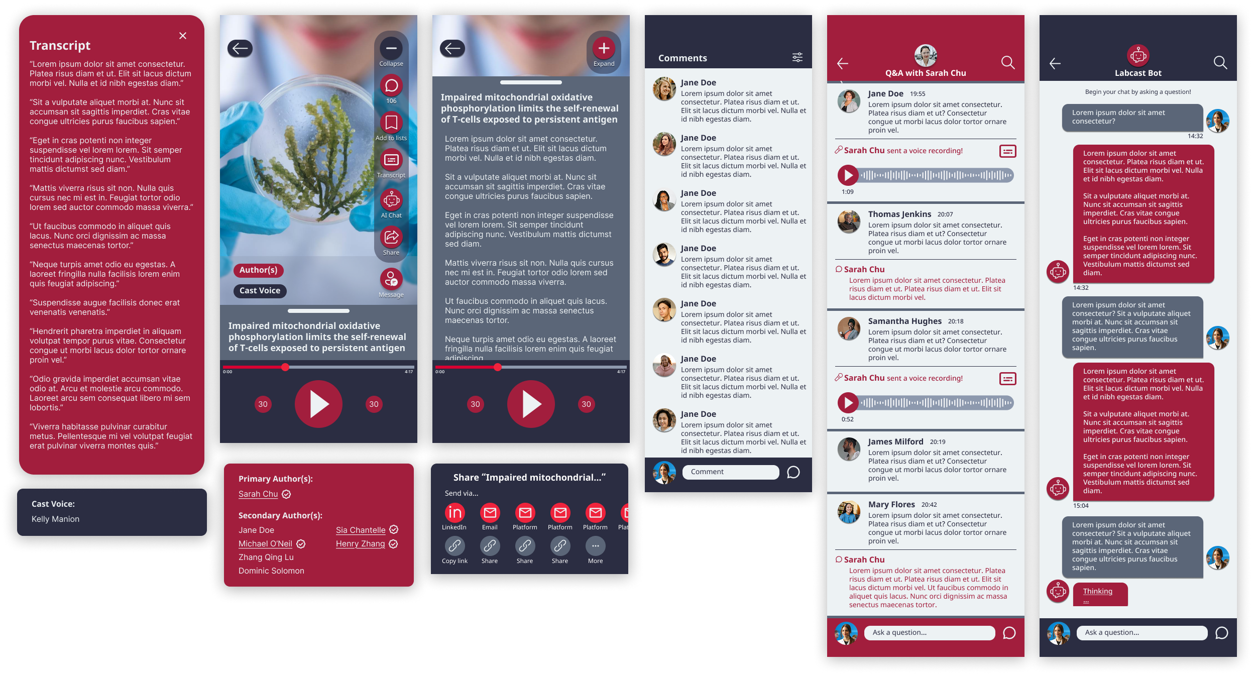
Audio-cast: Users can tap on a research post and listen to a reading of the academic journal.
Interviews with professionals informed me that several authors are often credited in one article — my solution was to create a pop-up credit tab that lists every involved author.
I prioritized economic spacing by introducing a collapsible tab with icons. Here, users can interact with several functions without cluttering the screen.
Main navigation: The bottom navigation bar icons will have a red accent to let the user know what page they are on at a glance. My goal was to make each page easily accessible whenever the user wants. Organization plays a key part in the design’s influence.
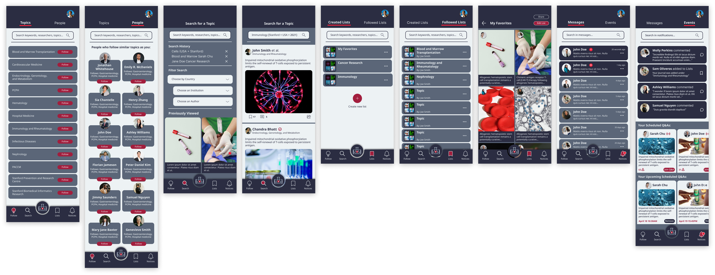
One can follow new topics/authors, search for a specific article, create lists, and keep updated on messages and notifications. Users can choose to be notified for live Q&As and be reminded in the notification tab.
User Profiles: One can view profiles of other users, including authors. Labcast invites accredited authors to sign up for the app, and the red checkmark lets users know who these invited authors are.
There is an article, comment history, and lists tab users can view. An “about” page is also included so one can easily learn about an author’s credentials within the app.
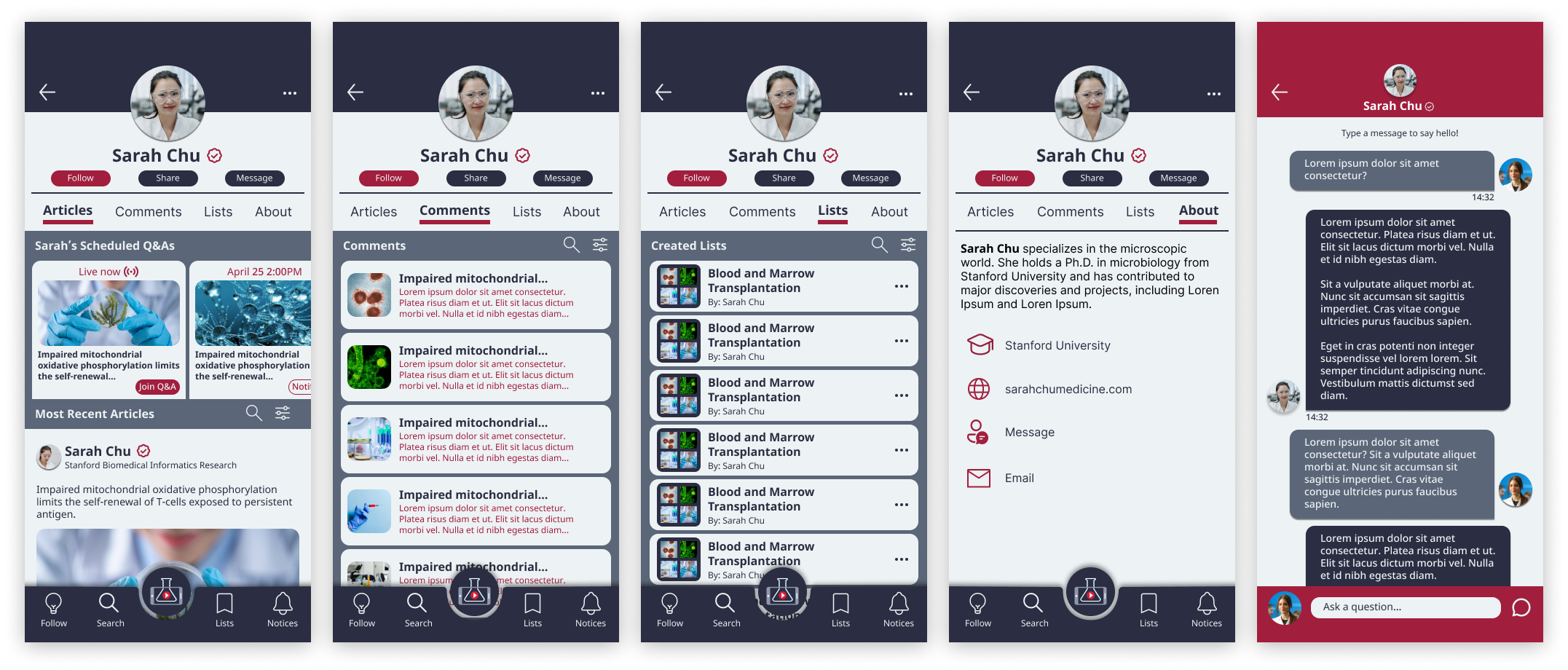
Due to the complex user flow built for the client’s students, all the pages I designed were not included in this section. The full prototype can be viewed at the end.
Moodboard and style guide


Inspired by the iconic imagery of hospital crosses, I created a palette that contrasted red with navy blue to push forward a sophisticated feel.
Although LabCast is social-media inspired, the core of the app is centered around professional research. I aimed for a clean interface that used a straightforward font so users could focus on the content without distraction.
User testing and revisions
While creating the high-fidelity prototype, I continuously tested the prototype with several participants who are in the science field.
The design was received positively, as users enjoyed casually navigating the app to view research in a social-media style. However, feedback revealed that there was room for improvement in consistency and clarity in the UI.
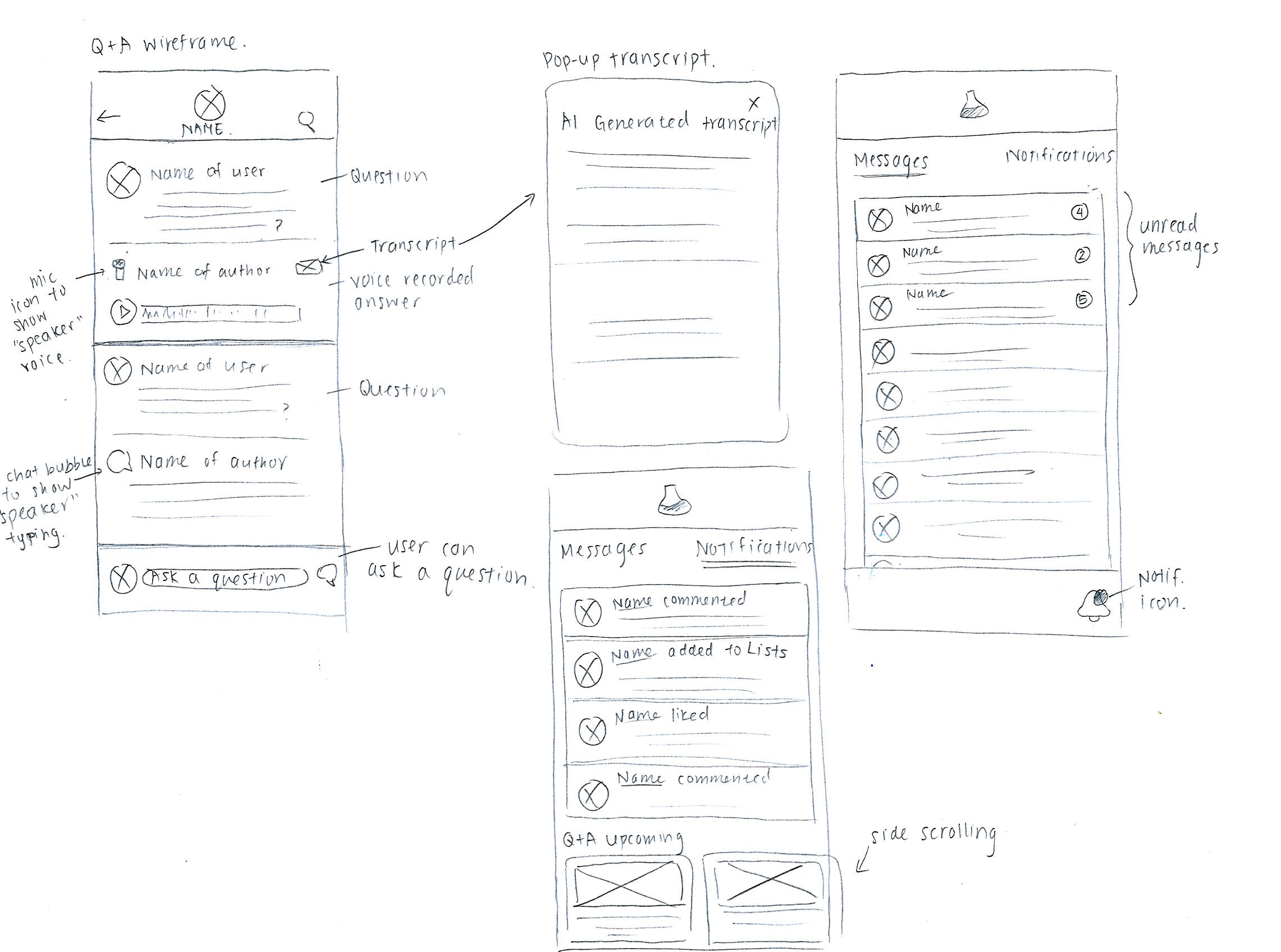
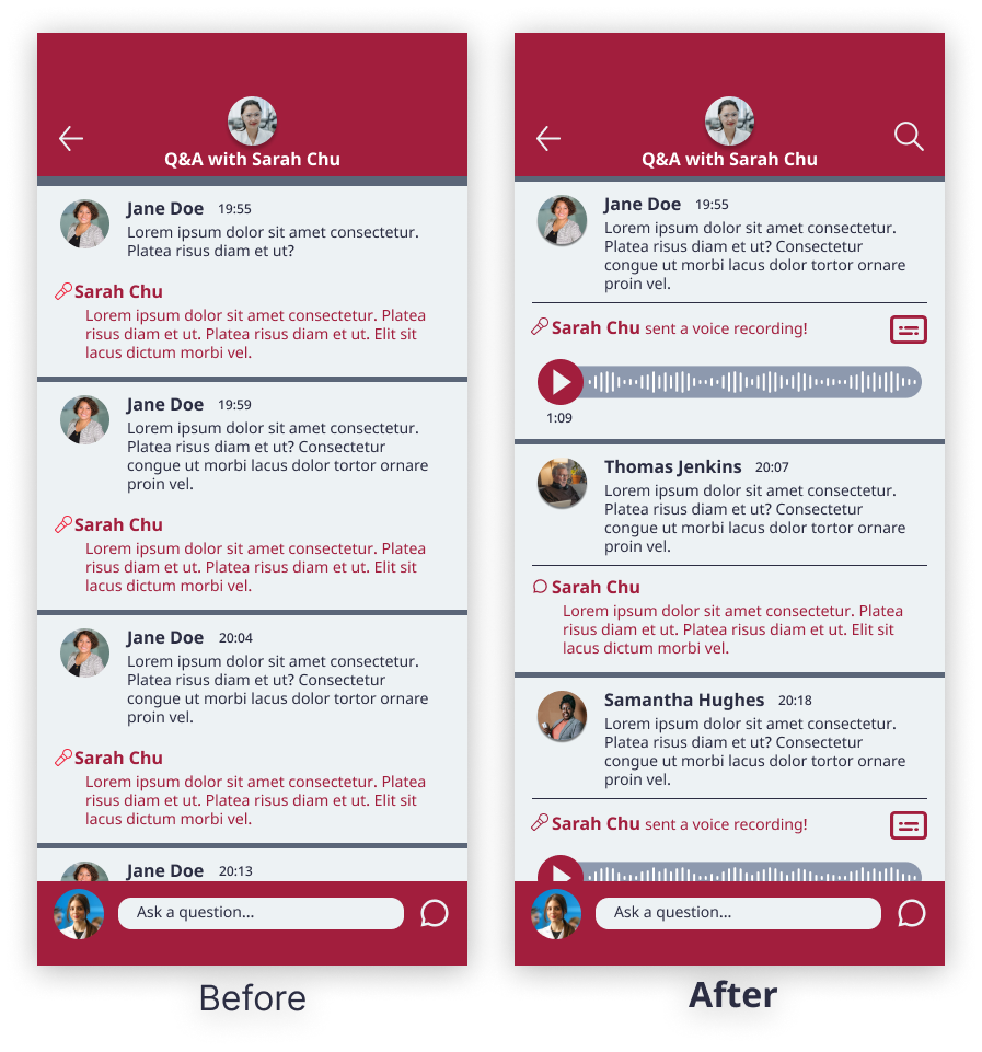
Highlighting Labcast’s audio feature
Users were concerned that scientific discussions could be quite lengthy. Authors taking extended time to type during a live session could be detrimental to the Q&A.
I included both a voice and typing feature.
To prevent confusion, the mic icon is for voice recordings, and a speech bubble icon for typed answers.
An AI transcript button was added for accessibility.
Taking advantage of expectation
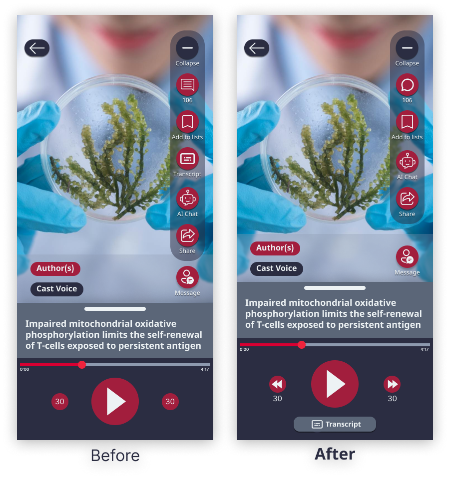
Two users struggled to locate the transcript button initially. As avid music app listeners, they expected the transcript in the bottom bar, like lyrics to a song.
I removed the transcript button from the collapsible icons and placed it on the bottom, where users can easily access it at first glance.
Adjusted the icons for reverse and fast forward for clarity.
UI updates for a better experience
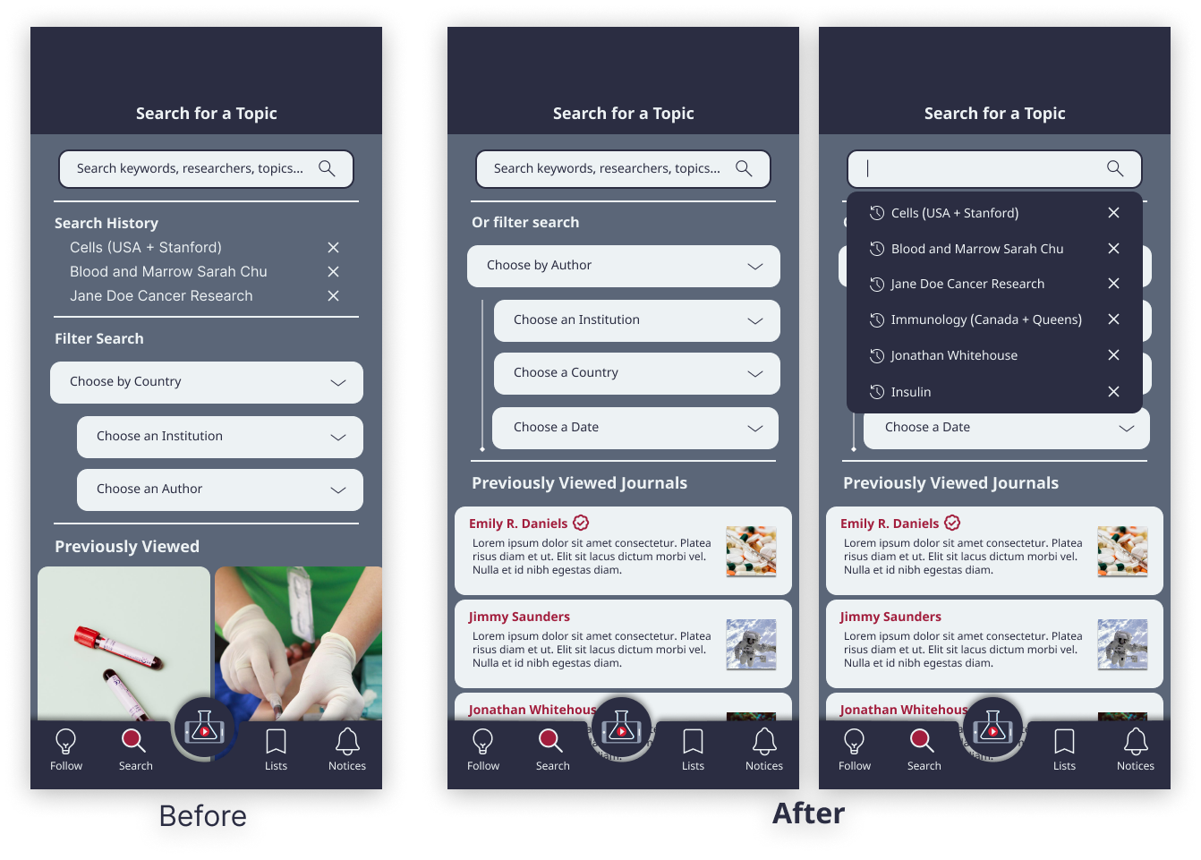
When searching for a topic, multiple users expressed that the search page felt outdated and provided limited information.
I created a drop-down search history menu once users tap on the search bar.
Designed a clearer journal history layout with more information at a glance so users can immediately know what they are searching for.
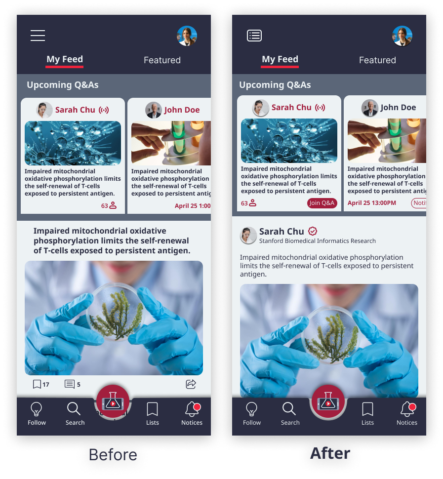
In an earlier iteration where articles had no author listed, some participants thought the research was conducted by AI. This made them wary, as research heavily emphasized credentials by human scientists and peer review.
I pushed for a more user-driven design, so I added the main author’s name and the topic the journal was written under for more coherence.
New buttons were added for upcoming Q&As for clarity, so users can know to join live, or get notified later.
Final design
A customizable sign-on experience
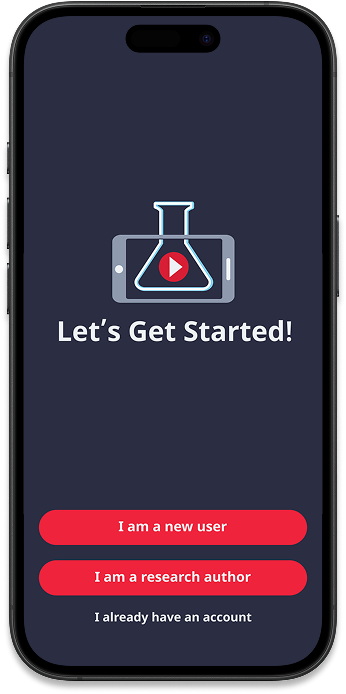
When signing onto LabCast for the first time, I designed an in-depth customizable experience so users can dive into their interests immediately.
This includes the option to import other social media accounts so LabCast’s AI can scan the existing algorithm to directly curate interests.
Encouraging engagement with research
As a social platform that encourages engagement amongst users, the main journal screen was designed to include features such as comments, chats, and lists.
I prioritized convenience in connecting users by including everything in a compact, economical space.
Interactivity between authors and users

The Q&A feature was designed to include a voice recording system to help authors create a seamless live experience.
I learned from interview participants that they appreciated listening to information, rather than being met with a large wall of text. With this, there is consistent interaction between the author and the regular user, bypassing the usual barricade of formalities in external communication.
Full interactive prototype
Give LabCast a try!
(For a shortcut - tap on the LabCast logo to bypass the sign-in screens)
Project reflection
What’s next for LabCast?
LabCast’s design development has been completed for now, as the client’s students go forward with coding the app. As the only designer on the team, I remain on standby once new design developments are requested.
Upon reflection by myself, some new additions I would add are:
Including a peer-review indicator once the team adds real scientific articles into the app.
Adding a direct link to the full research paper if it has been posted in external academic journal sites.
Key project takeaways
1 - Adapting the design and working in reverse
When I joined LabCast, there was an user flow interaction that was already designed by the client. It mainly highlighted the back-end system of the app, so I was challenged to adopt the technical information and turn it into visual design. I learned to problem solve by working in reverse, making sure I encompassed all the technical features that the client had wanted for his students to learn from.
2 - Continual feedback with the back-end coding team
The team would Zoom call several times to discuss the project. I would present the updated prototype by describing my thought process, ensuring that the team understood every design choice. Not only did this help the team stay on top of new changes, it also was helpful for me to receive feedback from the back-end coding team. I found that this paralleled my prior experience as a television animator, where there was a similar back-and-forth team dynamic with updating show assets for the animation’s demands.
3 - Learning about the scientific field
As someone who does not have much experience with scientific journals, it was a challenge to consider what was important to include. I strove to understand the userbase by interviewing several professionals to learn about the research articles they consume. This challenged me to prioritize the user experience instead of working off assumptions. It was similarly helpful for the client to learn user needs that were never initially considered.