Poke Genie Raid Remaster
Redesigning an unofficial Pokémon GO companion app for a more intuitive user experience
Reimagining Poke Genie’s raid feature with a more intuitive and nostalgic design
Poke Genie is designed to bring players together to raid at Pokémon gyms remotely. While the app is widely popular and commonly used among enthusiasts, opportunities exist to improve clarity and intuitiveness in the design and user experience.
My Role: UI/UX, Interaction, Logo, Animation Designer
Tools: Figma
Project Duration: April 2026, 2 weeks
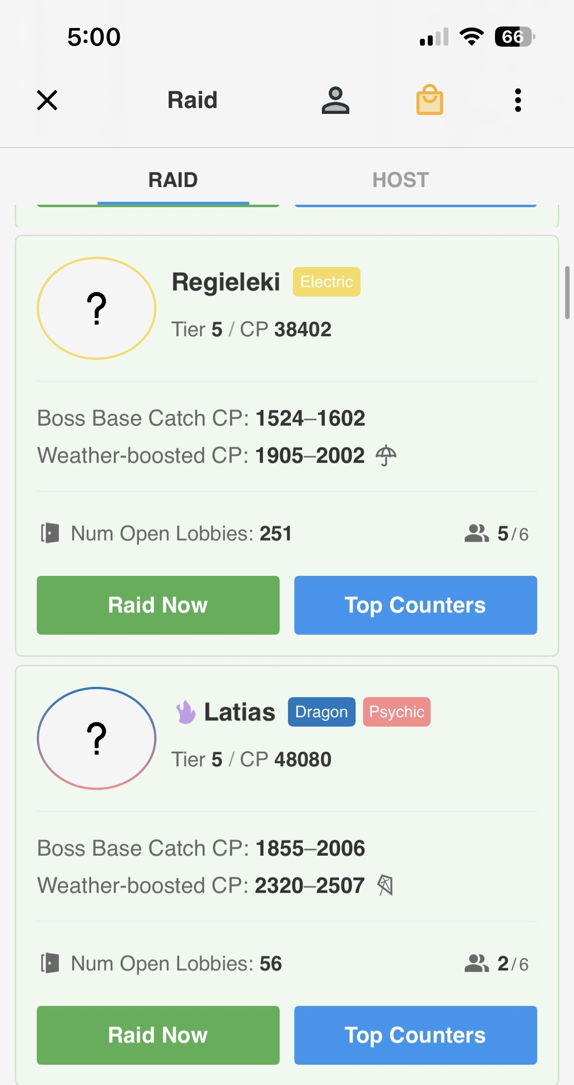
Original
Video walking through my final prototype
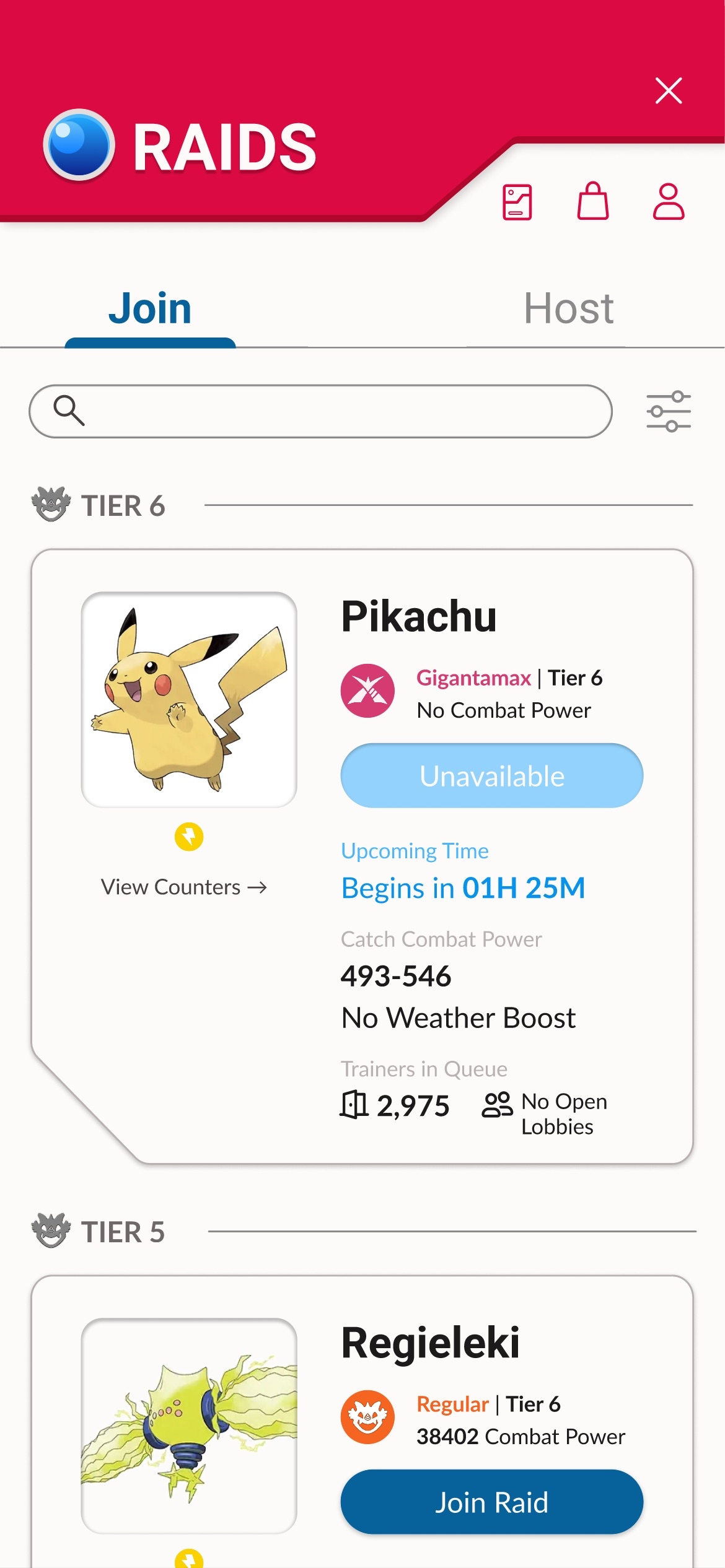
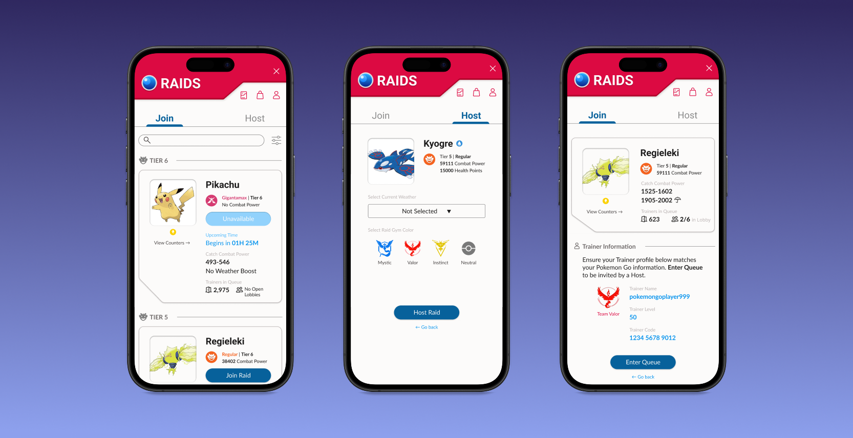
Redesign
Results show that users appreciate improved visibility of crucial information
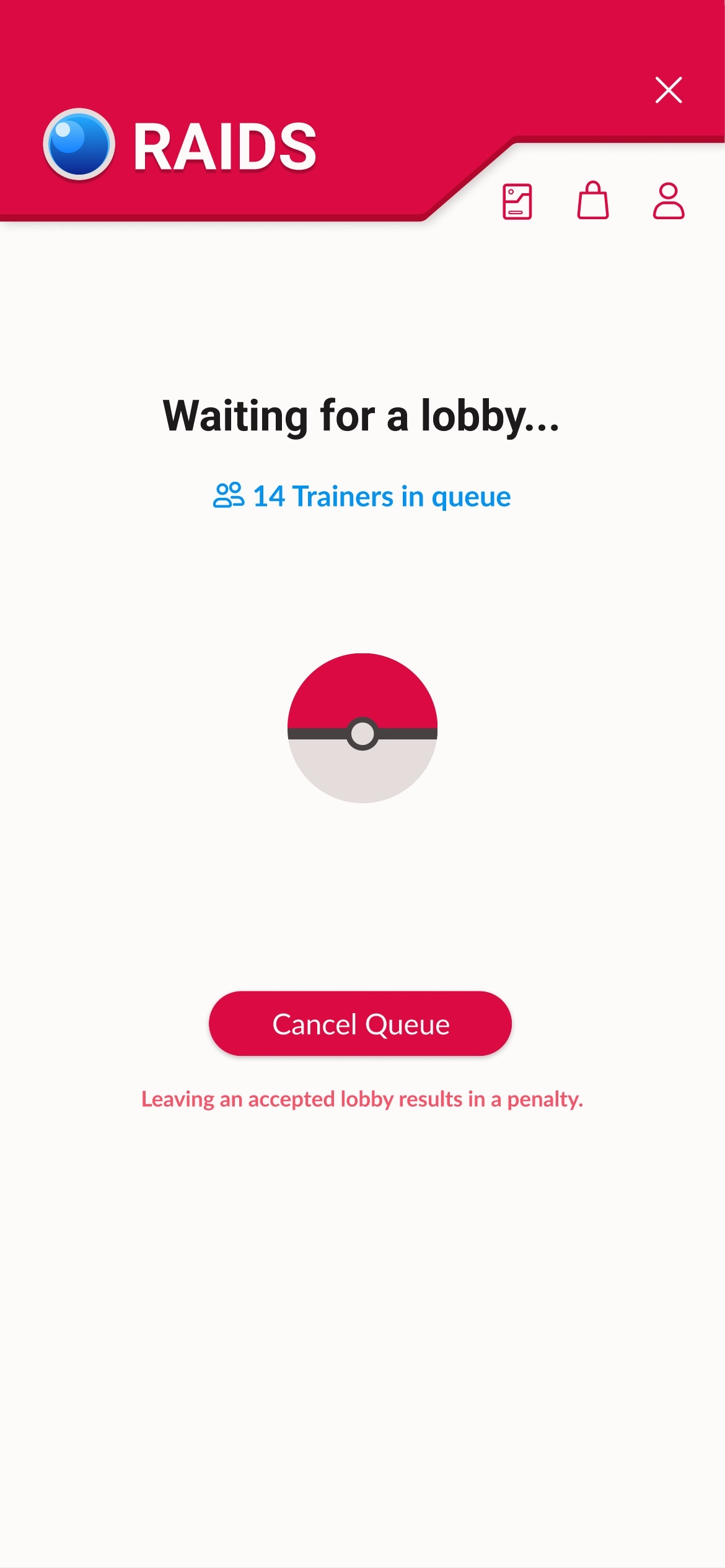
Before: No confirmation prompt
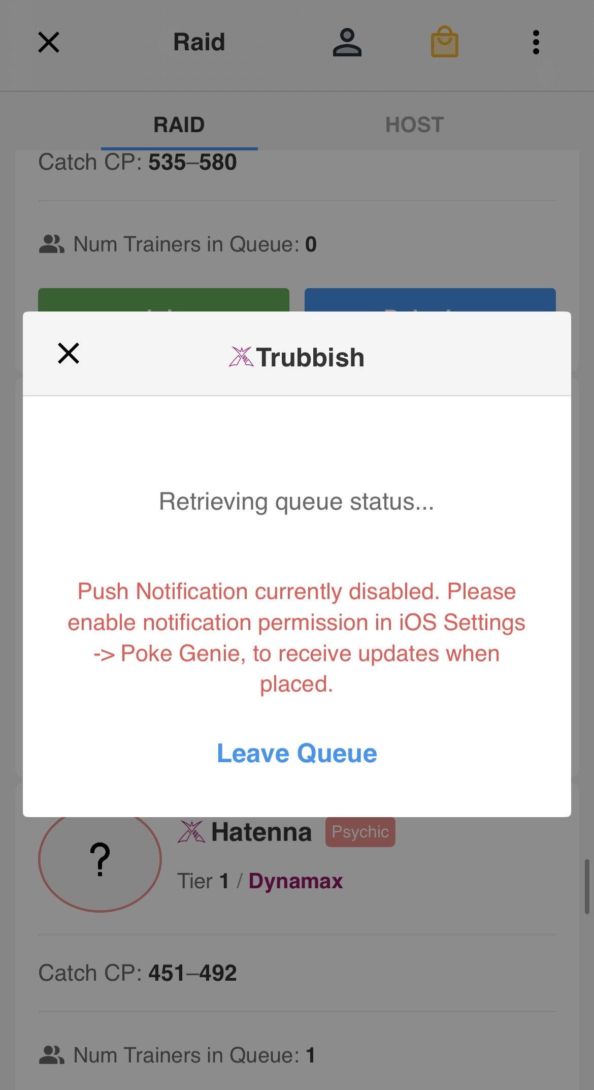
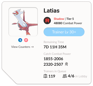
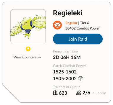
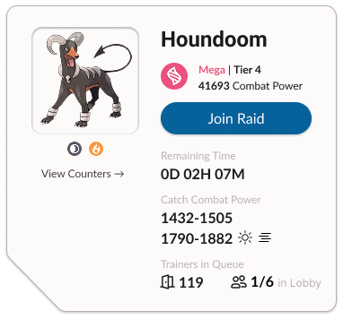
Screenshots of Poke Genie’s queue screen
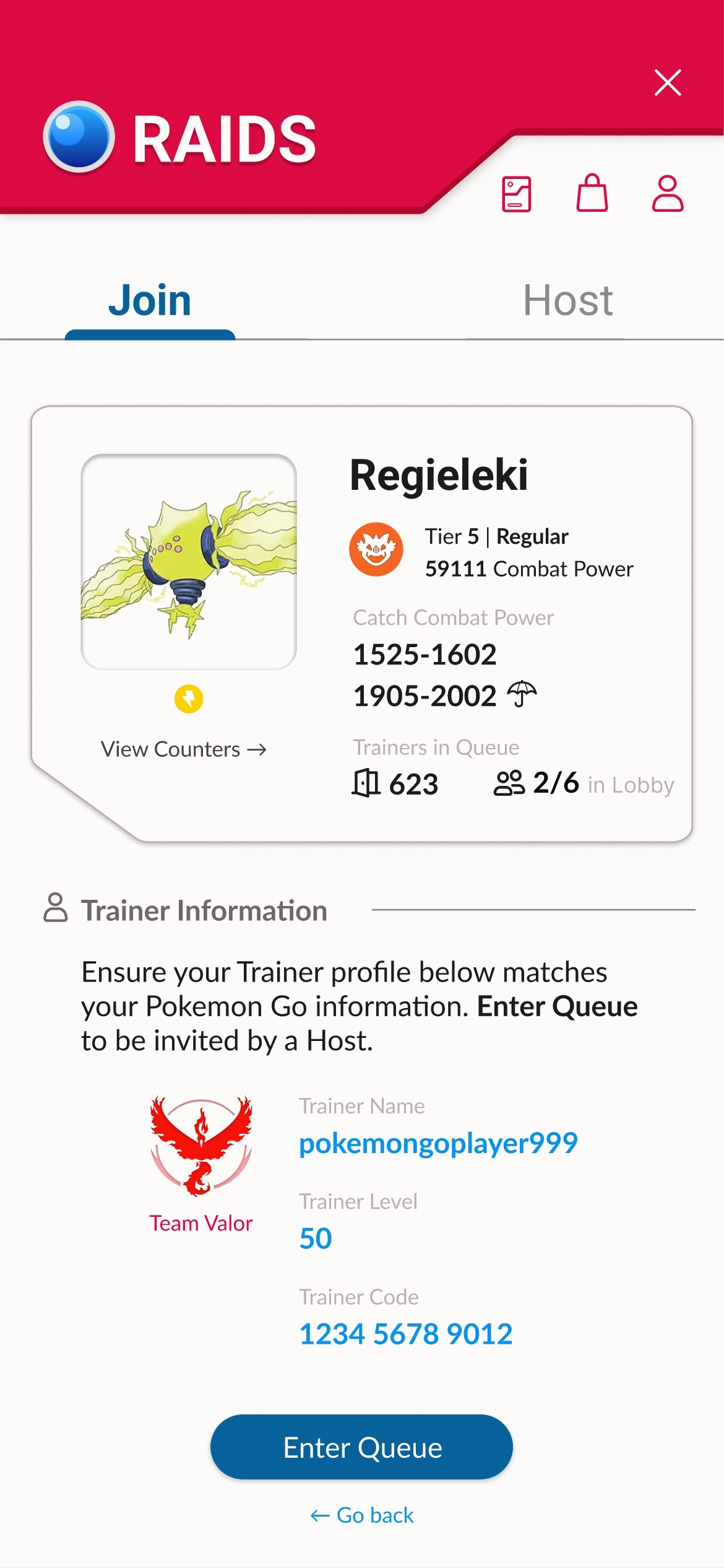
Redesigned raid confirmation screen
3/5 users expressed that they didn’t mean to join a raid in Poke Genie, but were thrown into a queue they could not abandon without a penalty.
Screenshots of the current app indicates no confirmation when tapping “Join”. Users found it jarring with popular raids when there are a multitude of hosts who immediately accept users without warning.
As a result, the participants felt hesitant to even join raids in the first place.
After: Including a confirmation page
I focused on improving visibility on key information. Users reported more confidence when joining raids, with fewer error-prone actions, due to a clearer indication that they are about to join a queue for a raid of their choice.
On a scale of 1-5, users reported a 5/5 confidence average when joining raids with the redesign, compared to the 2/5 in the original design.
As a result, it reduced raid drop-off and encouraged faster team formation because there was no panicked backtracking from users getting unexpectedly thrown into a lobby.
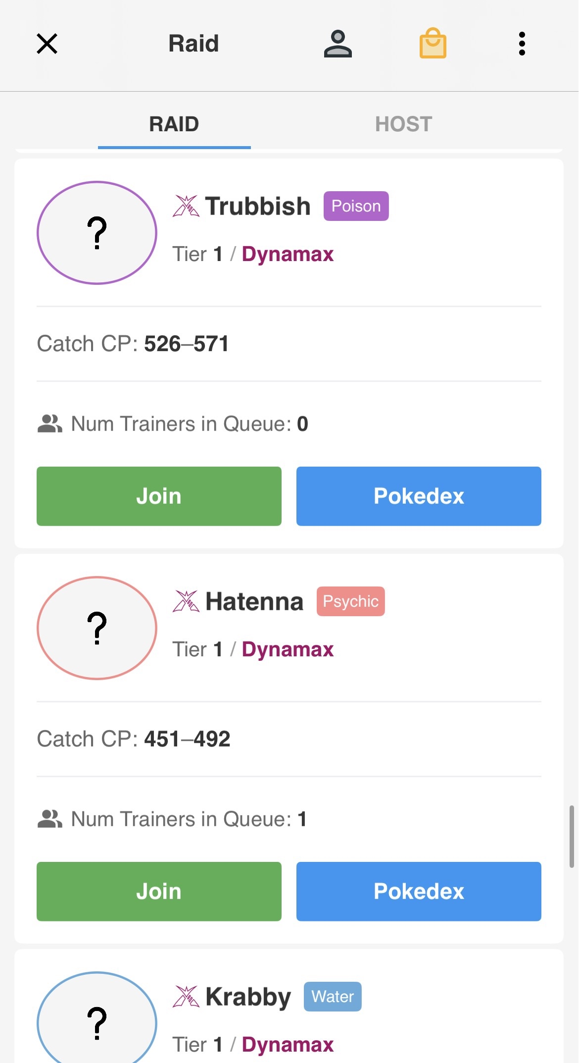
Before: Muted information
Poke Genie has inconsistent information that puts a strain on cognitive load. There are values missing in different listings; while icons appear to be used with certain raids like Dynamax and Shadow, the app forgoes using an icon in others such as Mega or regular.
Visual inconsistency causes participants to need more time to figure out what type of raid they are about to join. Newer players especially struggled to understand the significance of tiers in game.
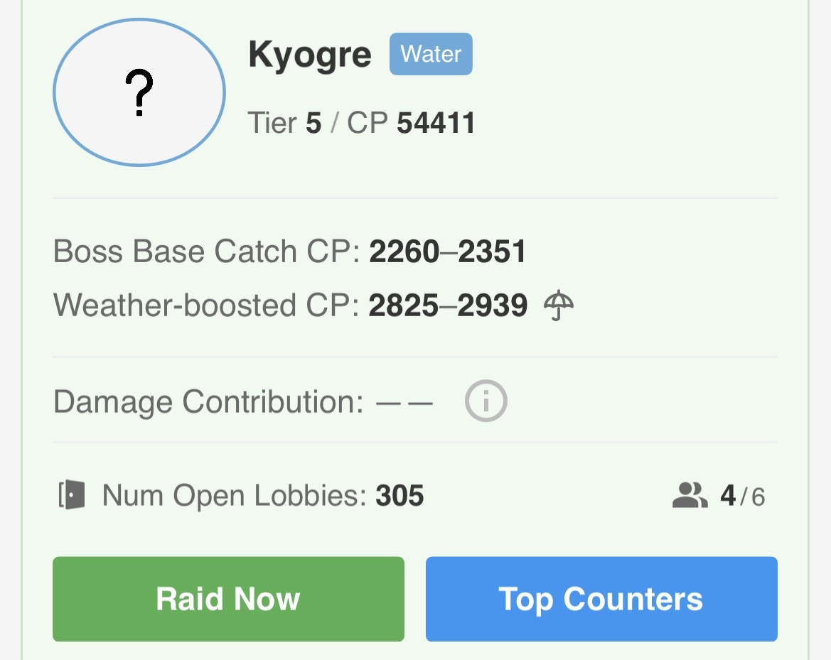
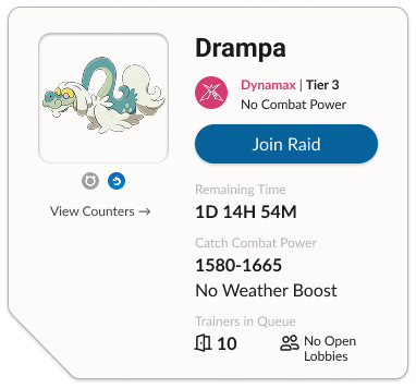
After: information at a glance
I streamlined the information and made everything consistent, even if certain raids had different mechanics. Users appreciated that the redesign explicitly told them that some raids had no combat power or weather boost.
Color-coding and using the in-game raid icons helped users find what information they were looking for at a glance. In total, it took users under 10 seconds to figure out what type of raid they were looking at, compared to more than 30 seconds previously.
To further reduce cognitive load, I implemented one main CTA button. “View Counters” became a ghost button that can still be clicked, but is not as important to the overall goal of the raid section.
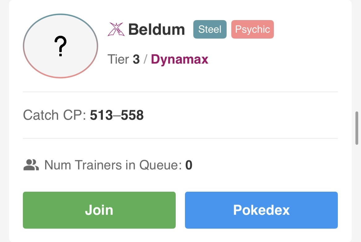
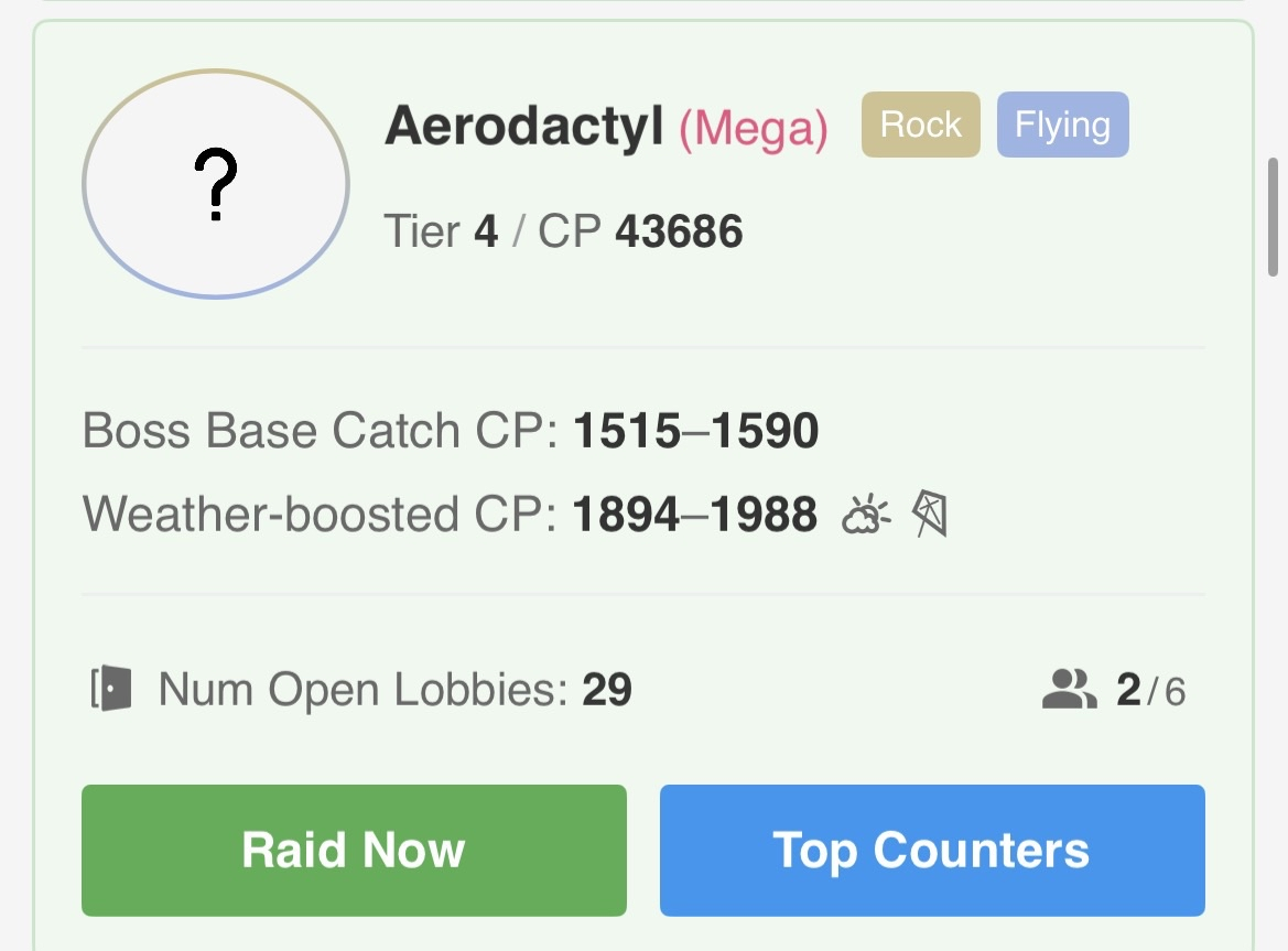
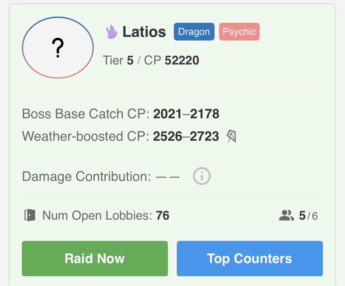
Individual raid listings on Poke Genie
Redesigned individual raid listings