

PokeGenie Raid Remaster
Redesigning an unofficial Pokémon GO companion app for a more intuitive user experience
PokeGenie: the unofficial companion app for Pokémon GO
PokeGenie helps players optimize their Pokémon through data-driven insights. With screenshot scanning or manual inputs, it allows users to analyze their Pokémon’s stats, simulate battle performance, and receive recommendations for raids and PvP battles. A raid feature is included, which allows players to join a remote raid, or host one for others to join.
My redesign will be focusing on the raid aspect of the app.
My Role: UI/UX, Interaction, Logo, Animation Designer
Tools: Figma
Project Duration: 2 weeks, March to April 2026
Video walking through my redesigned prototype
The challenge: Reimagining PokeGenie’s raid feature
While the app is widely popular and commonly used among enthusiasts, PokeGenie’s raid section presents an opportunity to improve visual consistency and polish. My theory was that improved design could strengthen its overall user experience and perceived quality.
My goal was to create a new and improved user experience with a more intuitive and nostalgic design. I prioritized highlighting key information to improve usability, while reinforcing consistency through a unified design system.
Original
Redesign
The results: More confidence in the user experience
On a scale of 1-5, participants reported a 5/5 confidence average when joining raids.
Compared to the 2/5 in the original design.
Reduced raid drop-off and encouraged faster team formation.
It took users under 10 seconds to figure out available raids.
Compared to more than 30 seconds previously.
An elevated sense of trust in the design, which helped improve the perception of hosting a raid on PokeGenie.
Compared to excessive cognitive load on users who expressed confusion with the original design.

With these challenges and goals in mind…
How can I make joining and hosting raids easier for PokeGenie users?
Results show that participants appreciated improved visibility
With my prototype, I interviewed 5 Pokémon GO players around the ages of 25-30, while 2 of them have used PokeGenie. They ranged from beginner casual and free-to-play, to moderately invested low-spenders. My goal was to observe and time their actions when joining/hosting a raid. Users were instructed to begin testing with the original app, and then move on to the redesign afterwards. This insight was crucial to measure the success metrics of the redesign.
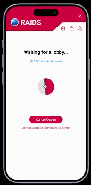
Original: No confirmation prompt
3/5 users expressed that they have clicked “Join” for more information on how to raid, but were thrown into a queue they could not abandon without a penalty.
The current app indicates no confirmation when tapping “Join”. Participants found it jarring with popular raids when there are a multitude of hosts who immediately accept users without warning.
As a result, they felt hesitant to even join raids in the first place.
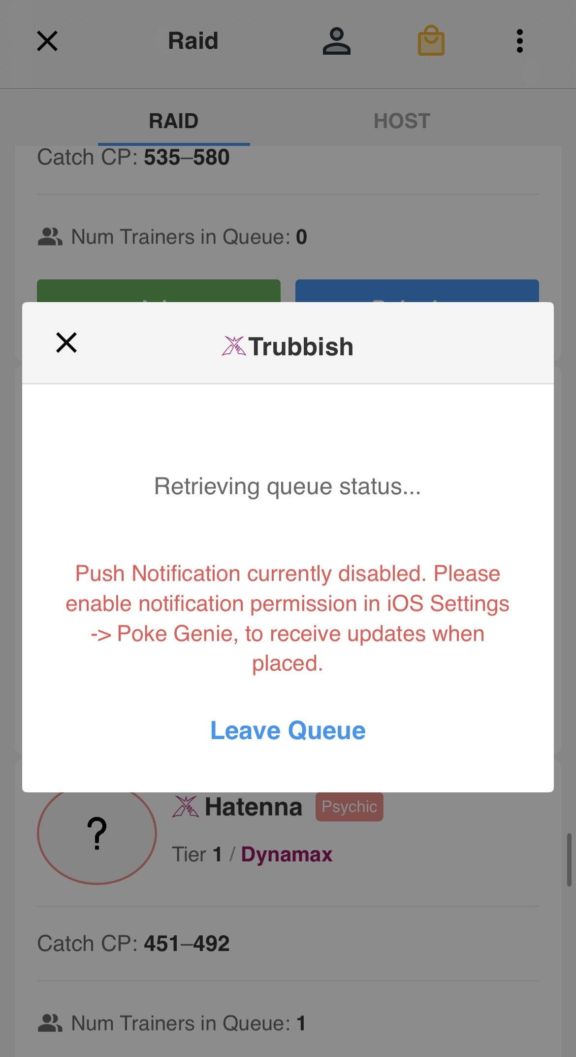
Screenshots of PokeGenie’s queue screen
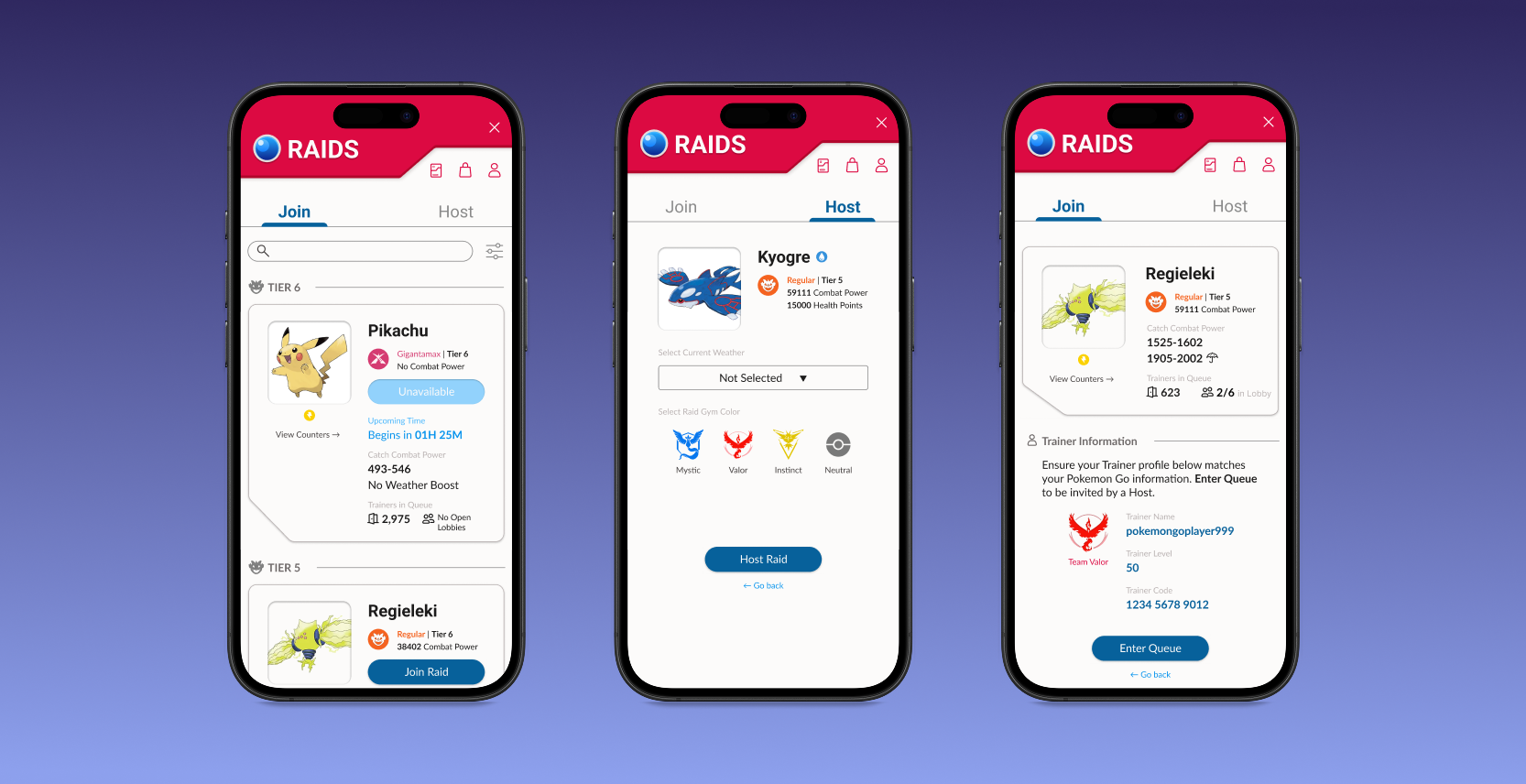
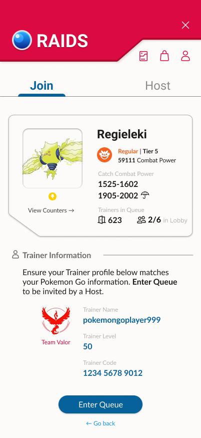
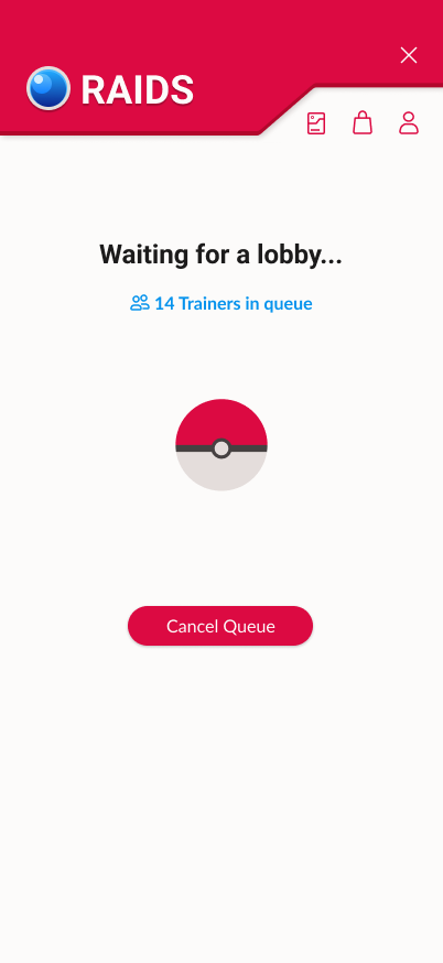
New: Including a confirmation page
I focused on improving visibility on key information. Users reported more confidence when joining raids, with fewer error-prone actions, due to a clearer indication that they are about to join a queue for a raid of their choice.
On a scale of 1-5, participants reported a 5/5 confidence average when joining raids with the redesign, compared to the 2/5 in the original design.
As a result, it reduced raid drop-off and encouraged faster team formation because there was no panicked backtracking from users getting unexpectedly thrown into a lobby.
Redesigned raid confirmation screen
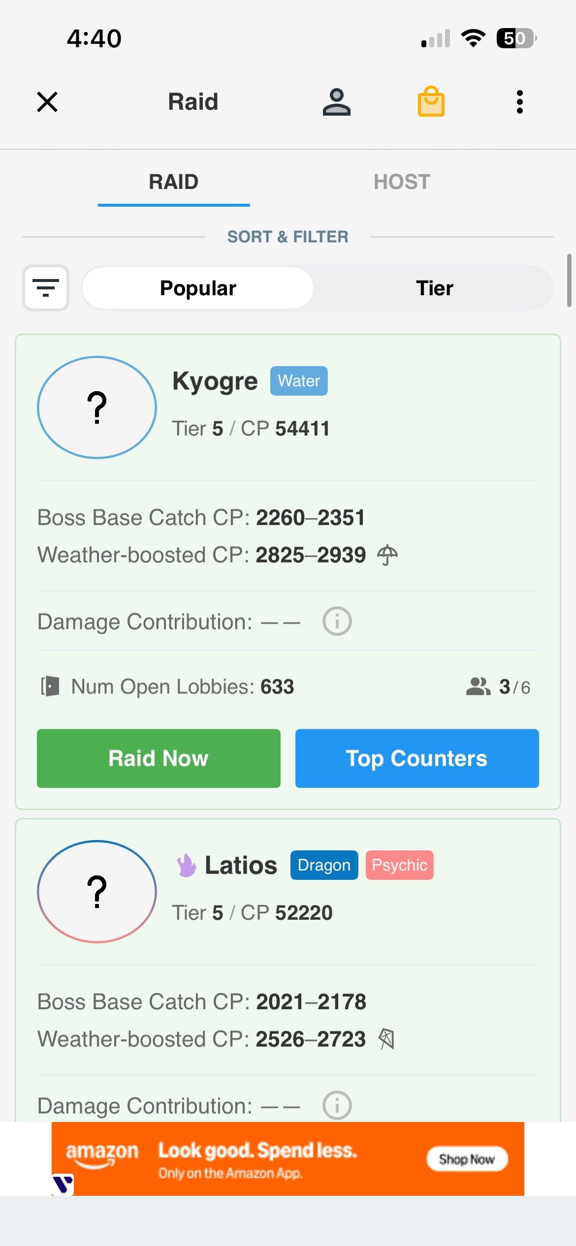
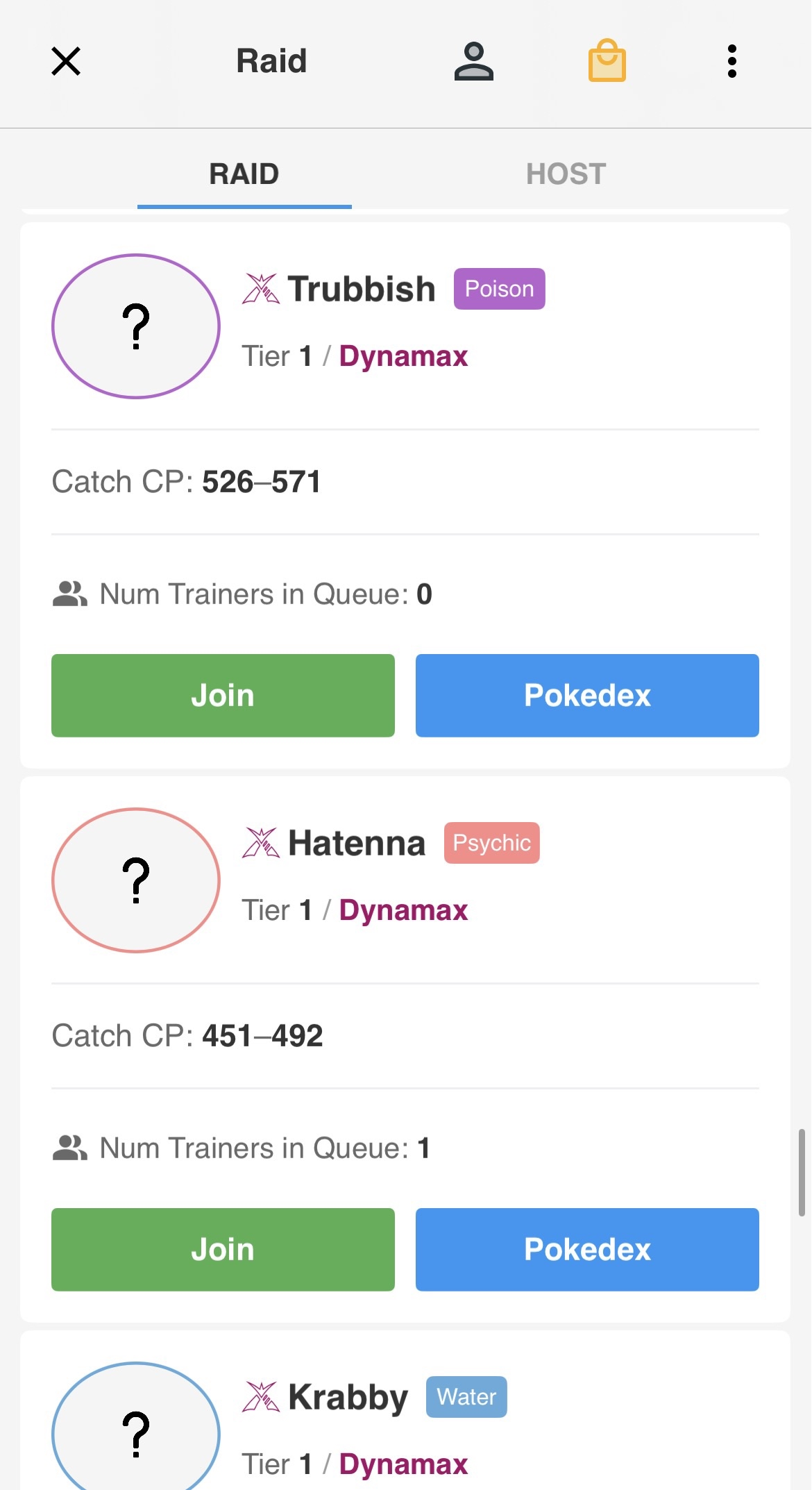
Original: Muted information
PokeGenie has inconsistent information that puts a strain on cognitive load. There are values missing in different listings; while icons appear to be used with certain raids like Dynamax and Shadow, the app forgoes using an icon in others such as Mega or regular.
Visual inconsistency causes participants to need more time to figure out what type of raid they are about to join. Casual users especially struggled to understand the significance of tiers in game.
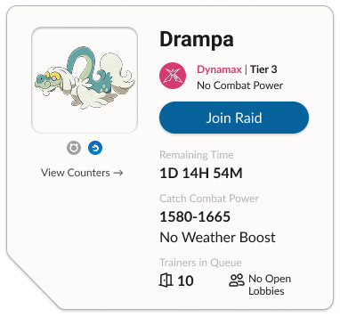
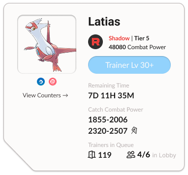
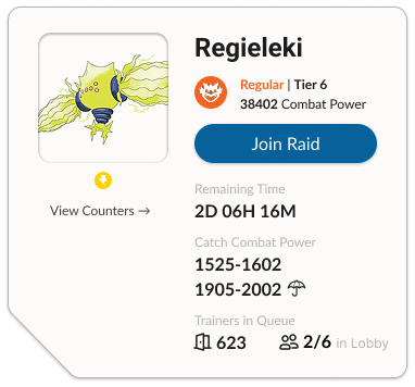
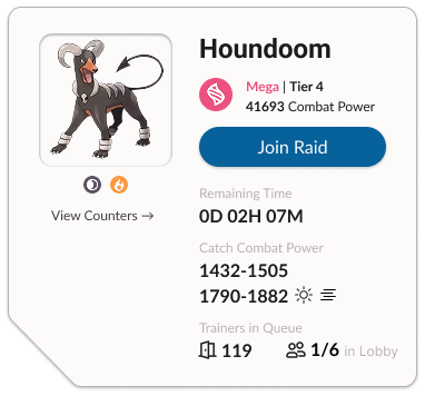
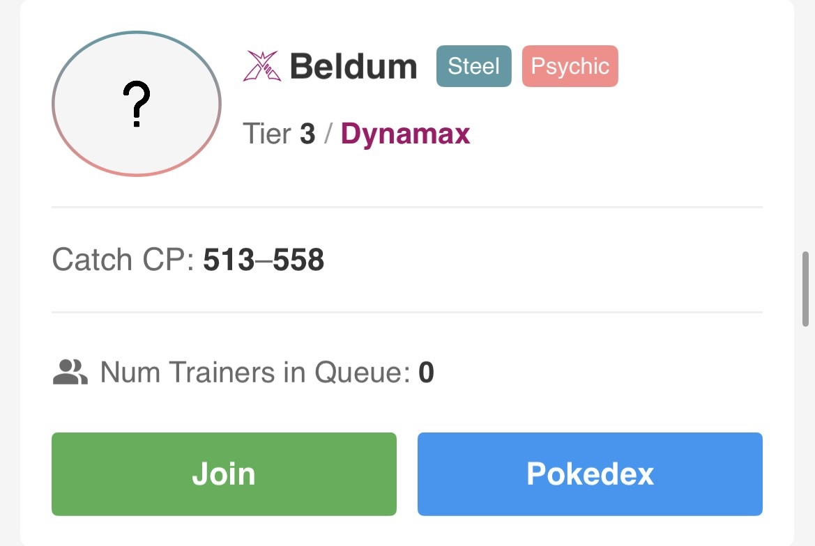
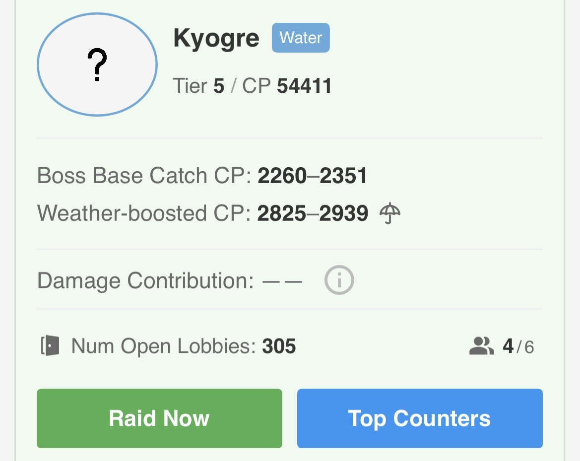
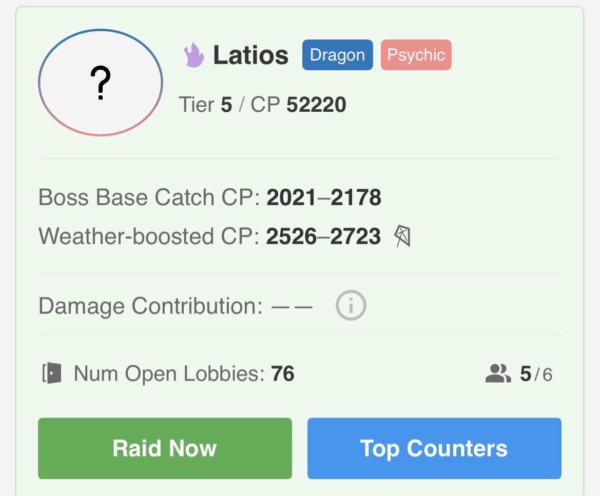
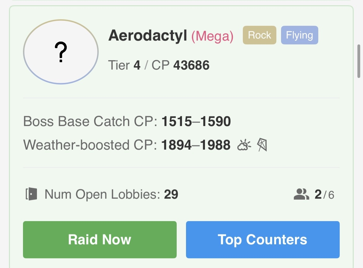
Individual raid listings on PokeGenie
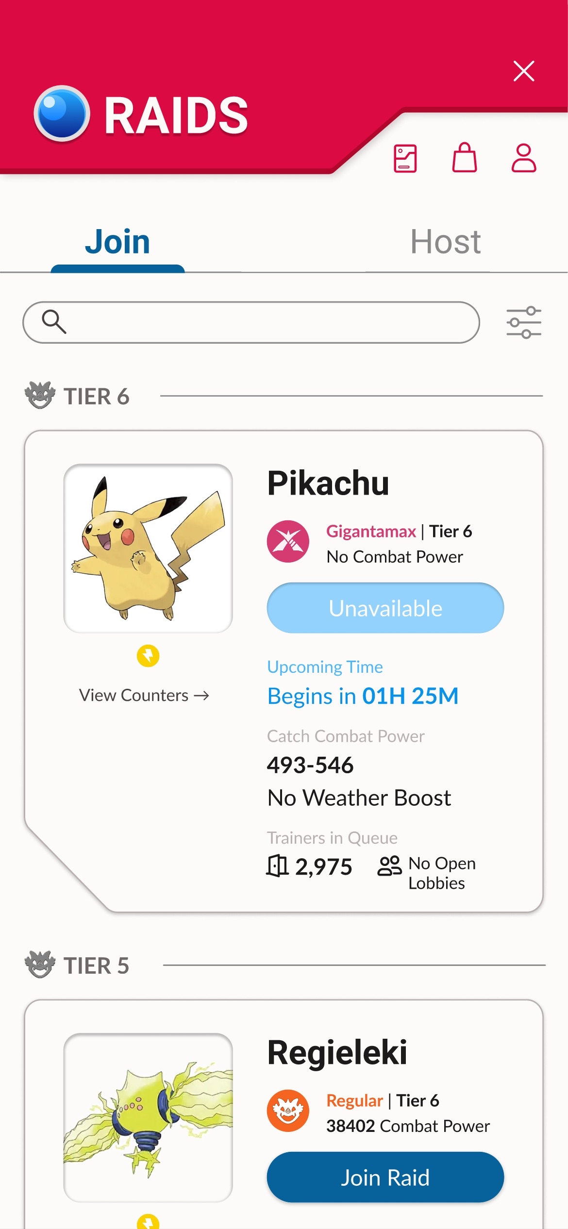
New: Information at a glance
I streamlined the information and made everything consistent, even if certain raids had different mechanics. Users appreciated that the redesign explicitly told them that some raids had no combat power or weather boost.
Color-coding and using the in-game raid icons helped users find what information they were looking for at a glance. In total, it took users under 10 seconds to figure out what type of raid they were looking at, compared to more than 30 seconds previously.
To further reduce cognitive load, I implemented one main CTA button. “View Counters” became a ghost button that can still be clicked, but is not as important to the overall goal of the raid section.
Redesigned individual raid listings
Original: Lower perceived quality
While experimenting with hosting a raid on PokieGenie, all 5 users reported that the hosting section felt unpolished, and their perceived quality of the design was low. Although the important information was presented clearly, participants reported feeling a lower sense of trust that the app will reliably help them host a raid.
Furthermore, with “Import” and “Host Raid” having a vastly different length and position, 3/5 users needed a couple seconds to locate the "Host Raid” button.
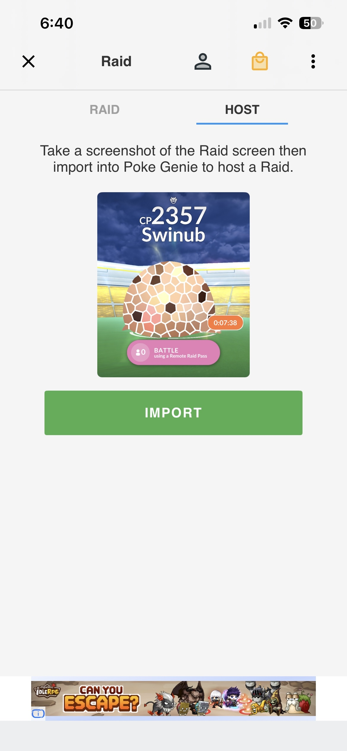
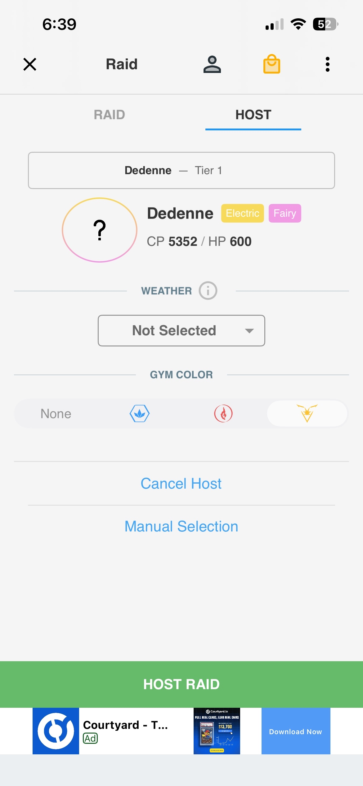
PokeGenie’s host screens
New: Elevated screen design
I kept the buttons consistent to reduce cognitive load. One user reported that they disliked the hassle of needing to upload a screenshot before they could manually input information, so a “manual selection” option was added to the initial import screen.
To further make icons clearer for beginner players, I added labels to gym color so it would make recognition easier at a glance. All participants expressed an elevated sense of trust in the design, which helped improve their perception of hosting a raid on PokeGenie.
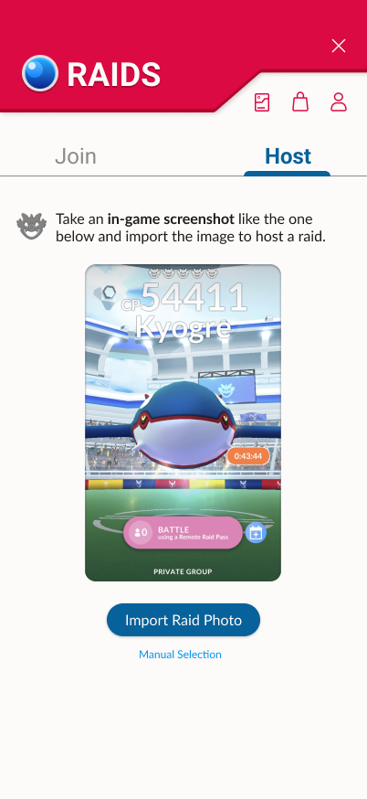
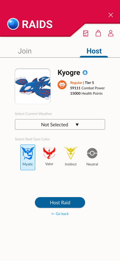
Redesign of hosting a raid
An experimental design process
Determining the important highlights
I created a list of important features to include in every raid panel. This included:
A clear “Join Raid” CTA button.
Colored icon with raid type.
Combat power and weather boosted combat power.
A button to view Pokémon counters.
Remaining raid time.
Interviews and general gameplay knowledge determined that this information should be clear at a glance. I sketched out a few wireframes on paper to experiment with initial layouts for my redesign.
I decided to remove the bottom navigation bar in my final design because PokeGenie has too many important features to include for such a small scale project. It will be explored upon future development.
Initial rough sketches of features to include.
Reorganizing information for clarity
I designed multiple variations of a raid panel in Figma, experimenting with the placement of information. This included making decisions based on what was most important to the raid section of the app.
A point of contention was the “counters” button. Experimentation and user interviews lead me to understand that it worked better as a ghost button that was accessible, but not important enough to be a secondary button.
Iteration 1:
One of my earlier iterations, where I placed “Join Raid” and “Counters” next to each other, similar to the original PokeGenie app.
Iteration 2:
I split the two buttons apart to further emphasize the difference between the primary and secondary buttons. Shapes were changed to further differentiate the two, but found that it made the design feel inconsistent.
Iteration 3:
Moving to just one CTA button, I made the “counters” button into a ghost button.
Iteration 4:
Readjusted spacing, moving the CTA button near the name and icon of the raid. Moved the type icons to the left, so there would be more space for longer Pokémon names. Included more information in “Open Lobbies Available”.
Designing with nostalgia in mind
With a franchise as iconic as Pokémon GO, I decided on an overall theme inspired by the Pokédex — a database in the fictional world’s universe that allows trainers to learn more about Pokémon. It invokes a sense of nostalgia and familiarity, which can help users feel drawn to the app.
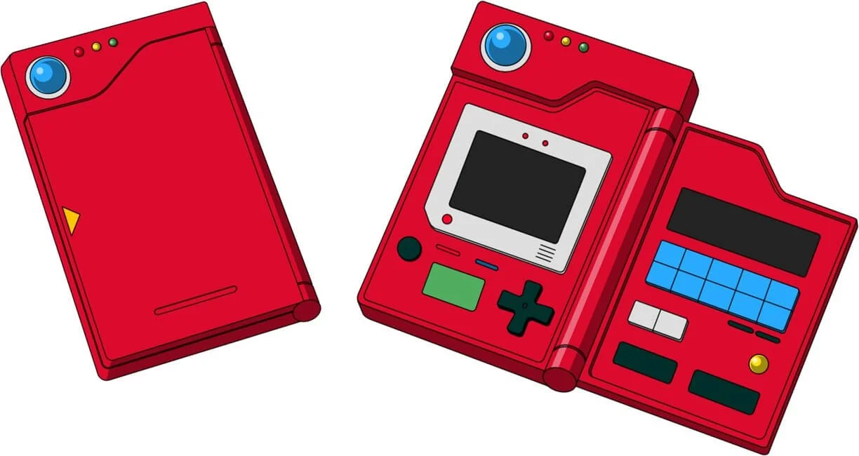

An iconic Pokédex
The top bar of my redesigned raid section
Drawing inspiration from my reference, I used red and blue as the primary colors. To make the information easily legible on a phone screen, a combination of two classic sans serif fonts were used: Roboto and Lato.
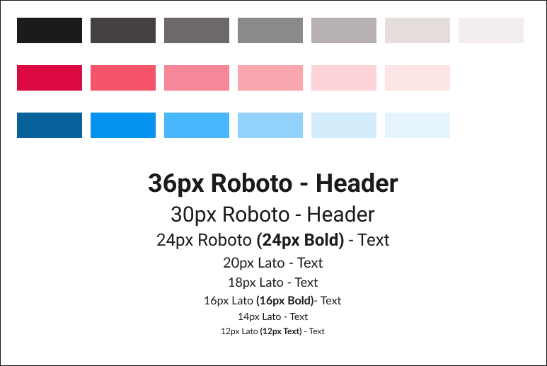
Font and color
A delightful loading animation
While searching for a raid, there can often be a queue where players wait in line to be accepted by a host. I animated a spinning loading Pokéball to reassure the user that the app is actively processing the request. This reduces user uncertainty and prevents repeated actions.
Rather than making the loading animation move at a linear pace, I opted for movement that felt like there was weight to the spin. Variety in something as simple as a spinning loading animation can help movement feel interesting.
Loading screen animation
Frames of the loading animation
Iterating for better usability
Throughout designing the raid section, I conducted continuous testing with participants. Two users preferred if the raid type text was more obvious, as there can be multiple types of raids for one particular Pokémon.
For my example here, Pikachu is usually a Tier 1 regular raid, but a special event made the Tier 6 Pikachu Gigantamax raid available.
To make the distinction clear to users, I swapped the order of the descriptors and highlighted the raid type with the matching color of the icon.
Furthermore, I edited the button text for clarity so users can know that the upcoming raid is unavailable.

Before
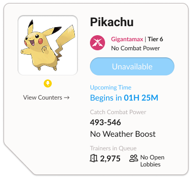
After
Going from initial iterations into the final design, I removed the time zone function. After some discussion with participants, I felt that it was unnecessary because PokeGenie allows for remote raiding from anywhere around the world.
This small change helped keep the section clear and concise, without the need for unnecessary bloating of information.
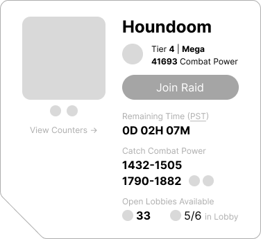
Before

After
The final design
Video walking through my redesigned prototype
Reflecting for future improvements
The raid remaster for PokeGenie was a short project that challenged me to improve an existing product’s visual consistency and polish. To create a better user experience, I put myself into the shoes of Pokémon GO players. I asked myself questions such as:
How can I make a skimming player understand raid information at a glance?
How do I increase the perceived quality of the design?
What can I do to speed up the process of hosting and joining a raid?
Testing my redesign with Pokémon GO players, I felt satisfied solving the usability issues they had while trying to join a raid with PokeGenie. With further time and exploration, I would continue implementing redesigns for the rest of the app.
I believe that a comfortable user experience can encourage players to continue using the app with every raid event that they’re interested in.